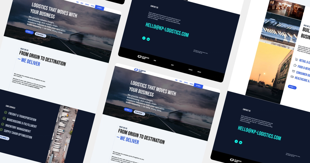
KP Logistics website
KP Logistics
A minimal, story-driven marketing website for KP Logistics that balances trust, clarity, and cost—built to support an early-stage launch and drive initial client inquiries.

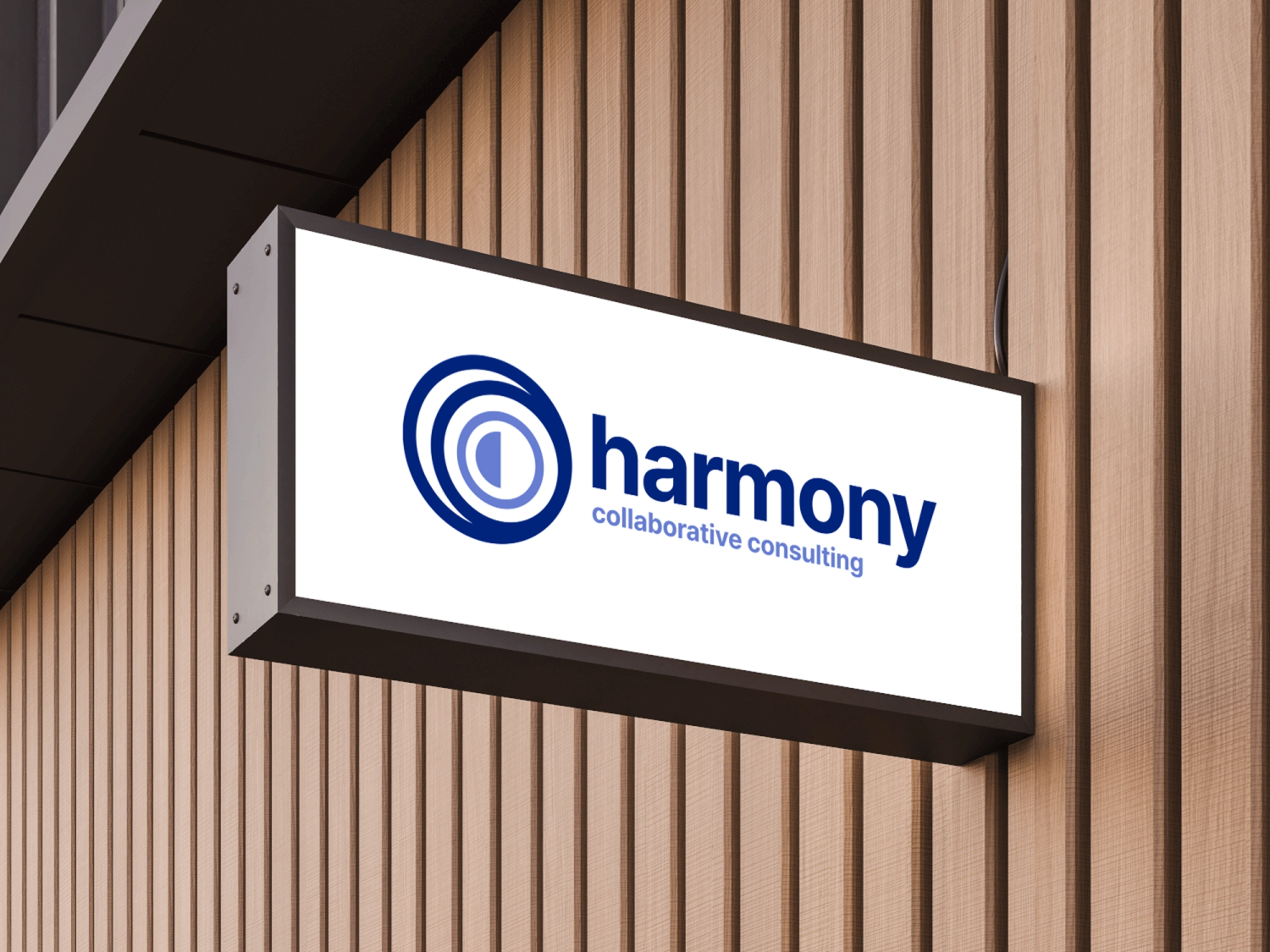
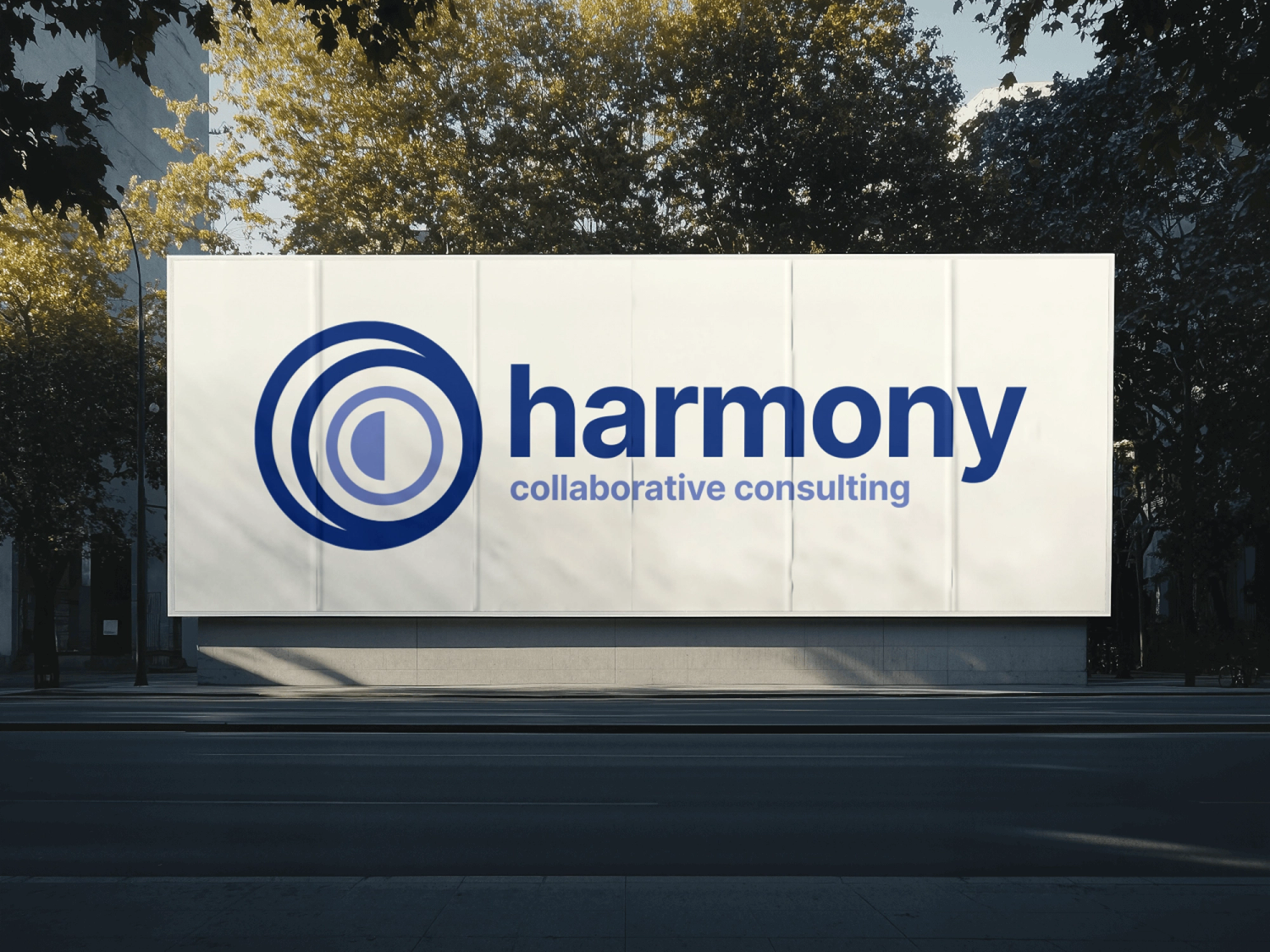
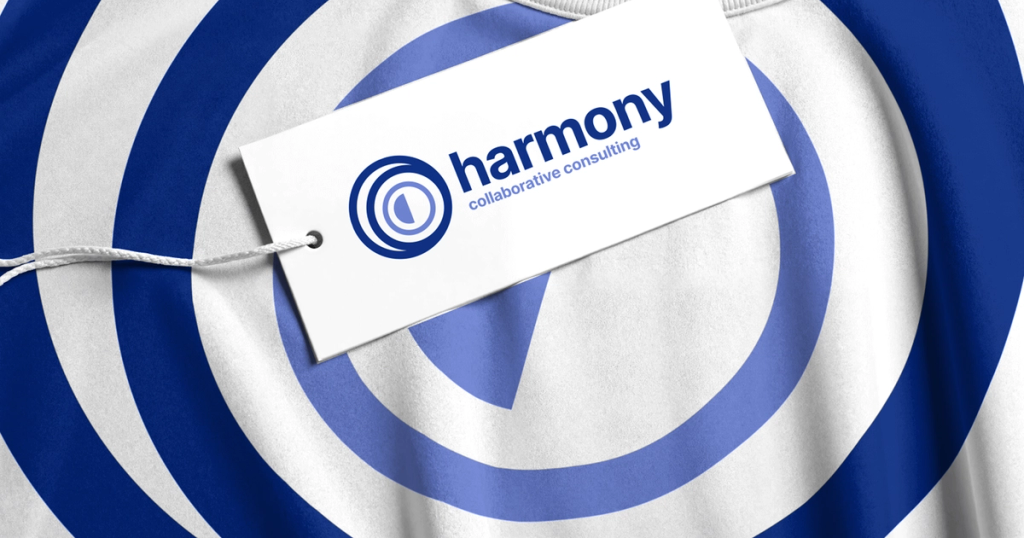
A refreshed logo for Harmony Collaborative Consulting that balances continuity and change—grounded, organic, and collaborative, while preserving the visual equity of a 25-year-old brand.
Harmony Collaborative Consulting is a long-standing consulting firm with over two decades of history. The client was evolving their positioning and needed a refreshed logo that better reflected how they actually work today—collaborative, adaptive, and people-centered—while still respecting the equity built over time.
Design a logo that felt grounded, open, and calming—communicating momentum and transformation without becoming overly corporate, rigid, or trendy.
The identity needed to balance continuity and change.
The logo was designed around organic forms and visual rhythm rather than sharp geometry or rigid symmetry.
Key ideas guiding the exploration:
The mark was intentionally kept flexible and human, prioritizing flow and balance to reflect how the company works with clients—through partnership rather than prescription.
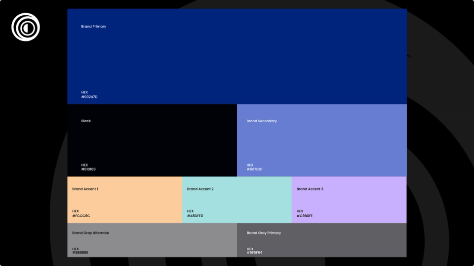
The core blue palette was preserved from the original identity, which had been in place for over 25 years. These colors were retained intentionally, both for brand continuity and because they have proven to be timeless and recognizable.
New accent and neutral tones were selected using the CIELAB color model, chosen for its alignment with human color perception—particularly its handling of lightness and contrast. This allowed the updated palette to feel modern and accessible while staying visually harmonious with the existing blues.
The result blends an established foundation with a more contemporary, human-centered sensibility.
A refreshed logo and supporting color system that feels calm, collaborative, and modern—while remaining grounded in the company’s history.
The identity works consistently across brand applications, from digital touchpoints to large-format physical signage.