Problem
Harmony Collaborative Consulting has over 25 years of history working with organizations on strategy and transformation. As the firm evolved its positioning, the existing visual identity no longer reflected how the company operates today — collaborative, adaptive, and people-centered.
The challenge was to refresh the brand in a way that communicated partnership, momentum, and unity without abandoning the credibility and recognition the firm had built over time.
Outcome
Design a logo that reflects both continuity and evolution.
The identity needed to feel calm, grounded, and human while communicating collaboration and forward movement. At the same time, it needed to respect the brand equity built over more than two decades.
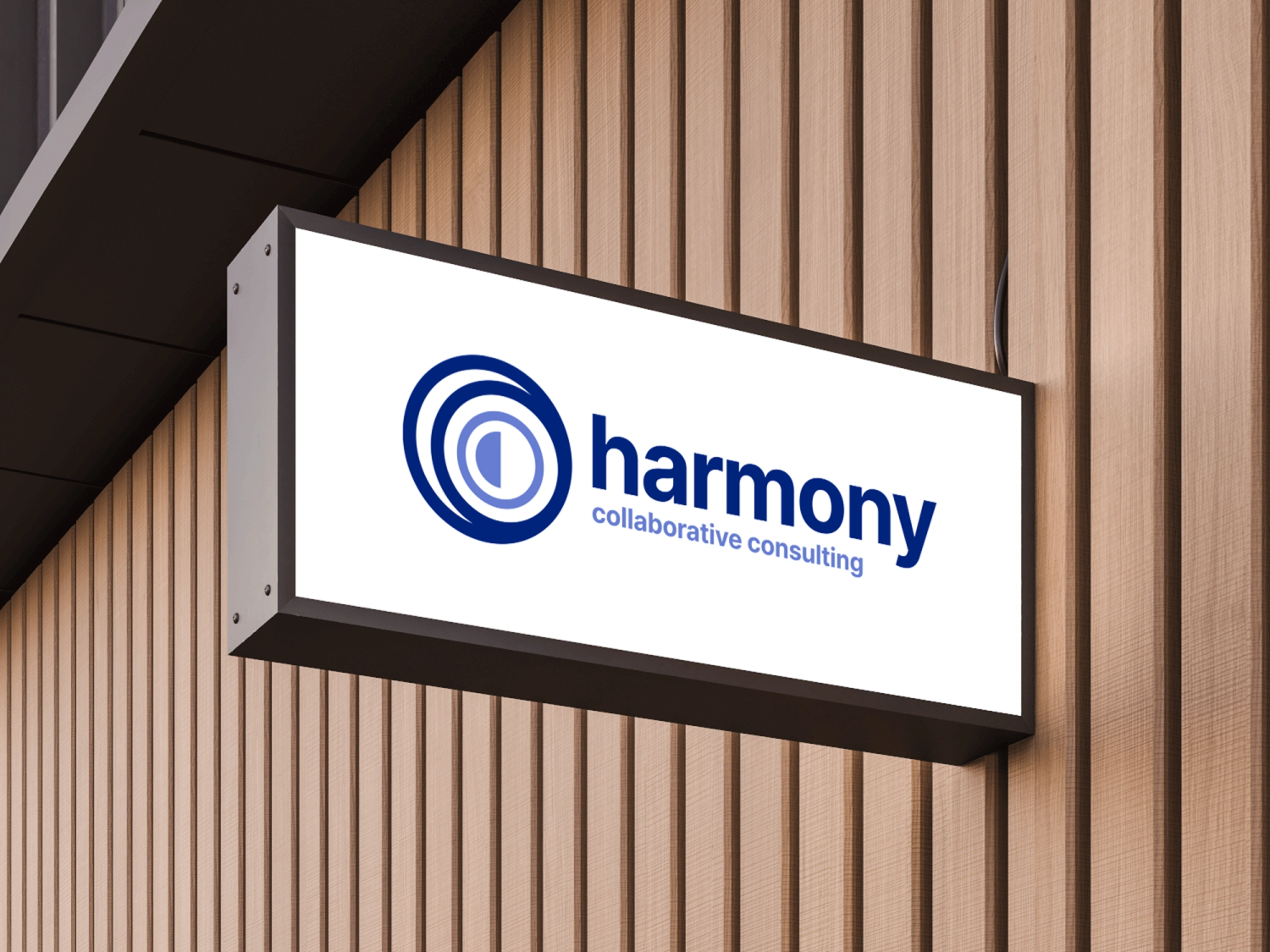
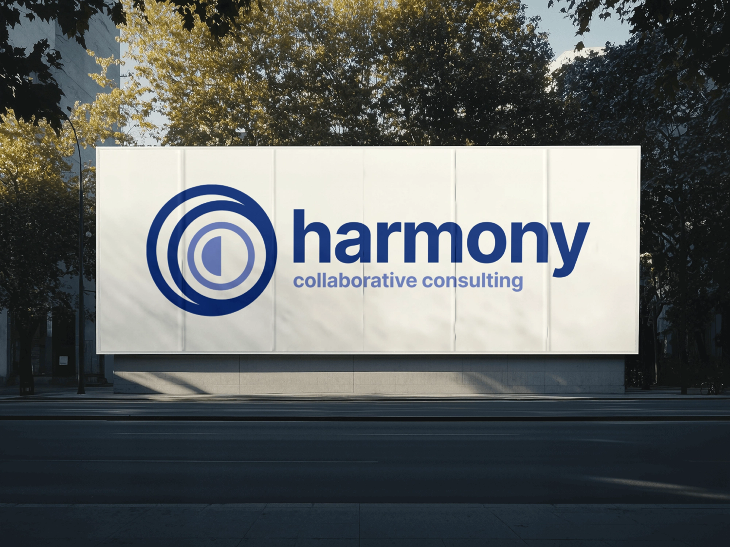
The goal was a mark that symbolized people working together — representing unity, partnership, and the collaborative relationship between consulting and business teams.
Solution
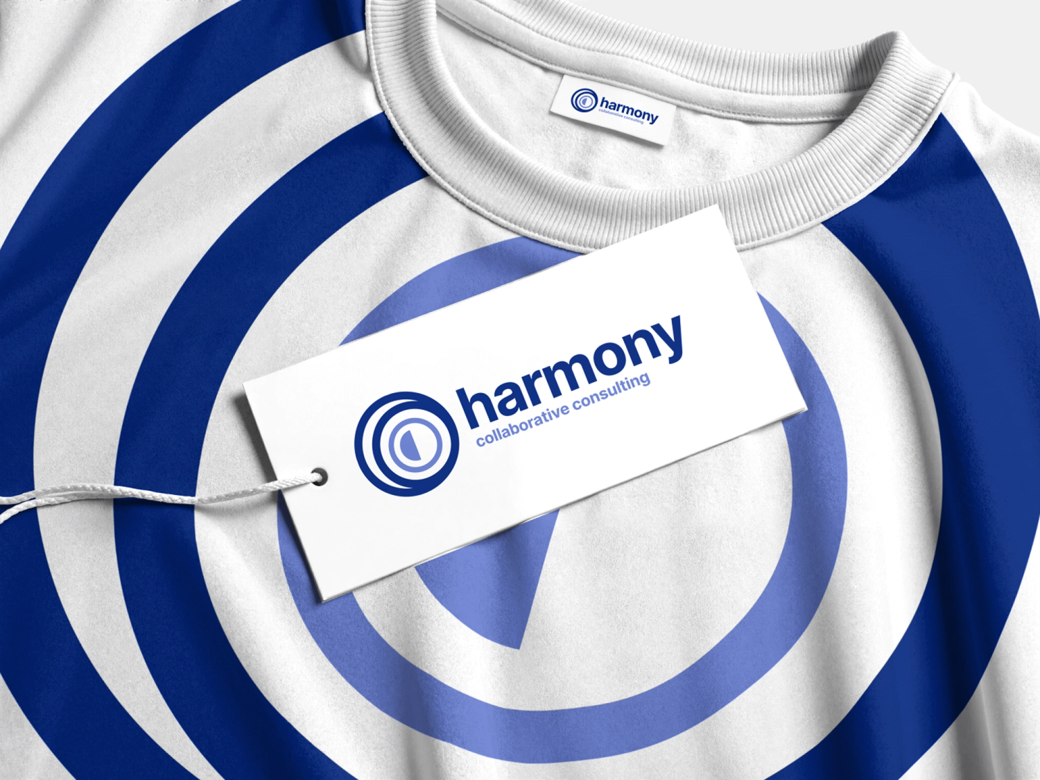
Kurocado Studio designed a refreshed logo built around organic forms and visual rhythm to reflect collaboration and shared progress. For established organizations, evolution often works better than reinvention.
Preserving familiar elements of the brand while introducing more human and organic forms can communicate growth and transformation without losing the trust built over time.
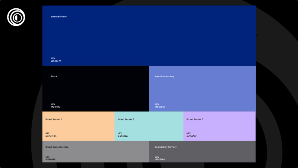
The original blue palette — used by the company for over 25 years — was intentionally preserved to maintain brand continuity and recognition. New accent and neutral tones were introduced using the CIELAB color model to ensure balanced lightness, contrast, and visual harmony.
The resulting identity blends continuity with a more contemporary, people-centered aesthetic. The mark communicates unity, partnership, and momentum while remaining flexible enough to scale across digital and physical brand applications.